
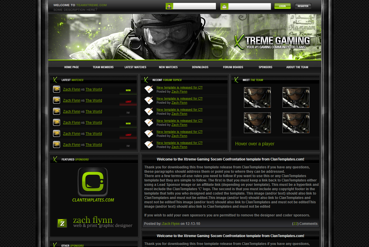
In the past I’ve made it known I don’t care much for flat UI web designs. I’ve always had a thing for designs like the one above. The amount of work of planning the layout, texture work, making it blend well really hit the spot. This is just one of many examples Clan Templates has to offer, FOR FREE!It’s odd though because while I downloaded many templates of theirs, I never really got to using them. But on the other hand, I downloaded them just to admire the designs and learn from them. The templates serves as an inspiration for me to learn how to design html websites. The copyright on this one reads 2010, 6 full years ago. In technology and internet time, that’s a good chunk. These days you have new frameworks, new trends, and new ideas on where we’re headed. So that’s where I decided to play around with this template. The first thing I did is see just how mobile ready it wasn’t, lol.
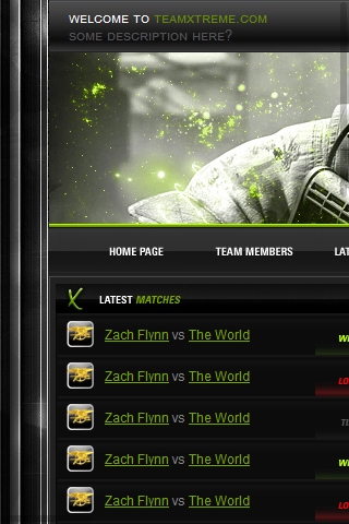
I knew from the beginning this was gonna be a challenge for me because this hasn’t really implemented any frameworks and used a couple of javascript files for displaying team members. Immediately I knew I would have to re-write the HTML damn near from scratch, using modified snippets from W3C School. Plans included implementing Bootstrap and reducing the need for so many images that helped create the original design.

So the background was easy enough to get back to looking to original. The sidebars on the main container though proved to be a challenge. I first tried to just use the original image, but later in the design, elements started to not line up properly and when I resized it, it wouldn’t scale too well. I finally got the idea of using border images and converted the original image to one that can be used as a border. Perfect! Worked like a charm and it even scales somewhat. The very top bar gradient is all CSS. And instead of a static image under that, I used Bootstrap’s carousel. Under those is the main menu which again, I used more CSS gradients to avoid having to use the original images. Then I have three columns based on Bootstrap so they all scale properly on mobile devices.
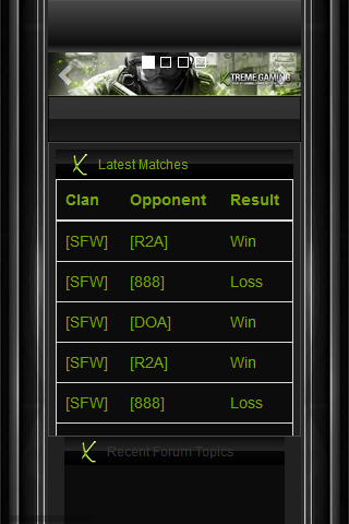
The template is still a work in progress as you can see, there is a ton of work to do and I’m enjoying every minute of it. Once I get the hang of this, there are more complicated designs I’ve seen I’d like to resurrect to modern standards. And if you’re wondering, when I’m done I can’t distribute the template as I do not own the copyright, these are merely for my own personal use and education on a private server not available to the public. I’m just learning what to do so I’ll know what limits I have for my own designs. I hope you enjoy today’s blog and perhaps inspire you to try the same.
 Burnout3D